ShopDreamUp AI ArtDreamUp
Deviation Actions


Comments137
Join the community to add your comment. Already a deviant? Log In
Just great! (Hey, this is my first critique...aren't you special? <img src="e.deviantart.net/emoticons/w/w…" width="15" height="15" alt="
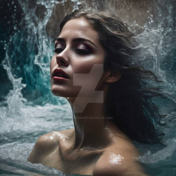
I think the other critique you received was right on about a few points. Certain things you might not want to change because of the intention or underlying meaning behind the piece, but I'd experiment with his suggestions and see if you think they're an improvement (of course, it's a pain in the ass to go back and make changes, especially when everyone already likes it so much). I agree about the line on the left--since we don't really know what it is, it just looks like something in the background that got blurred and moves the eye away; I think it also flattens the foreground image somewhat. The window, too, is a good point; however, I see what you're going for here, and it would detract from that if it was simply removed. I'd suggest dimming it and shrinking it a little, so that you stay the main focus and we're not lured toward the blinds. It's hard for me to tell at what point the image is cropped on your body (if in fact you did crop it and that's not just the shot itself). I'm not sure about extending it as much as he said, but I do think that if the line of your body on the bottom of the image curved slightly more, it would help make things "feel" fuller (and I don't mean that in only an anatomical sense)...but that may be a minor thing. I think you do need to lessen the brightness on your ear so it doesn't, as he said, "pop" out quite so much.
Having said all that, it's a wonderful piece...accomplishing almost exactly what I said I wanted to see in my other comment: raw, mature, edging on vulnerable. I think you're right about aesthetics sometimes overshadowing your meaning. Not to offend anyone, but I wonder if you were less attractive if people would see this as more "artsy" than "sensual." Though the other critique was very well written, I think it focused a little too much on that, perhaps thinking that was mainly what you were going for. I really like the intention you have here, and I had an idea about bringing that more to the fore. Breaking away from the fantasy, the way you described it in your reply, is a great idea--I love it in fact--and I thought if you made the room more visible so that we can see texture but pushed it back (or conversely, your image forward), keeping it shadowed and darker, of course, than your image, it could create a sense of fantasy with you in front...but a box effect, and the reality of "her" own room, behind...like you mentioned. Just an idea. The effect I see in my head is hard to describe.
As with most of your shots it's very eye-catching, and one's initial reaction might tend to think it's simply because of your appearance; in reality, though, it's because you have a talent for engaging the viewer. After commenting on "Mother Jessica," I was looking at some other stuff and thought, "Oh, this is so boring," and came back to your piece thinking, "What is it that she does to make this so interesting?" As for "Covered in Magic," it's wonderful, gorgeous the way it is...so if you don't feel like messing with it, you have no lack of people who appreciate it, including me. But as I said, I like the thought process behind this and feel a little hungry to see it blossom further.
As usual, great work! <img src="e.deviantart.net/emoticons/b/b…" width="15" height="15" alt="